---
description: "Create Dalton experiments using AI suggestions, prompts, or manual edits directly in the visual editor — no code required."
---
# Creating Experiments
Create experiments using AI suggestions, prompts, or manual edits.
## Dalton Suggestions
When your page is scanned, Dalton proposes new high-impact tests based on CRO best practices. You review each proposal and decide which ones to act on — nothing is selected or launched automatically. Accept a proposal as-is to launch it, or refine it first with a prompt.
## Selecting Elements
The editor is interactive: click any element on your page to select it. The selected element is highlighted, and Dalton's AI receives it as context — so every prompt and manual edit is scoped to exactly what you picked.
## Prompting
With an element selected, describe the change you want and Dalton builds the experiment for you:
- **Create a new experiment** — Click an element and tell Dalton what to change. E.g. 'Add social proof underneath this element.'
- **Iterate on an existing experiment** — Prompt again to adjust its style and content.
Because the AI already sees the element you selected, prompts can stay short — you don't need to describe where the change should go.

For detailed guidance on writing effective prompts, see [Prompting Best Practices](/editor/prompting-best-practices).
## Manual Creation
Prefer to build the change yourself? Click an element and choose manual creation. A modal opens where you define the variant by hand instead of prompting — useful when you know exactly what you want.
## Multi-Page Experiments
Want to run the same experiment across all your product pages, category pages, or blog posts? See [Multi-Page Experiments](/advanced/multi-page-experiments) for how to set up URL wildcards and avoid common pitfalls.
## What You Can Test
| Element Type | Can Test? | Notes |
|-------------|-----------|-------|
| Headlines & text | Yes | Any text element |
| CTAs & buttons | Yes | Copy, color, size |
| Section order | Yes | Move elements up/down |
| New elements | Yes | Banners, badges, social proof |
| Layout & spacing | Yes | Via prompts |
| Images & videos | No | Use [URL Split Tests](/advanced/url-split-tests) instead |
| Navigation menus | No | Requires backend changes |
| Dynamic content | No | Prices, inventory, etc. |
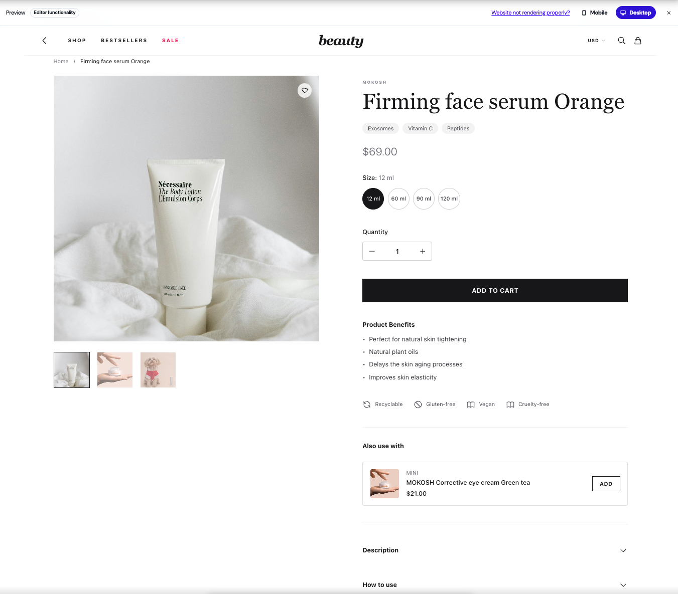
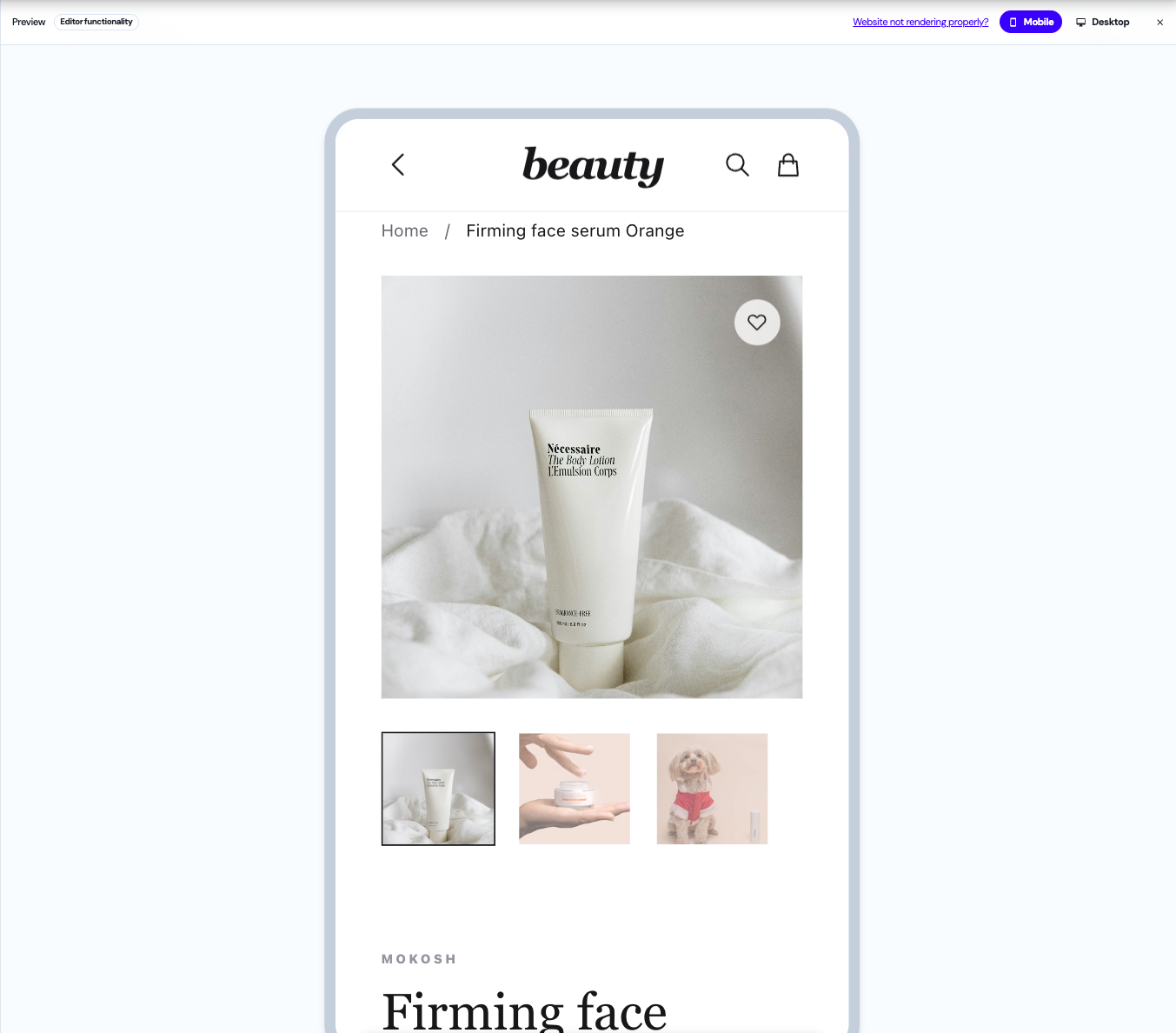
## Mobile & Desktop View
Preview and edit your experiments on both mobile and desktop directly in the editor.