

Appearance
Reading Your Results
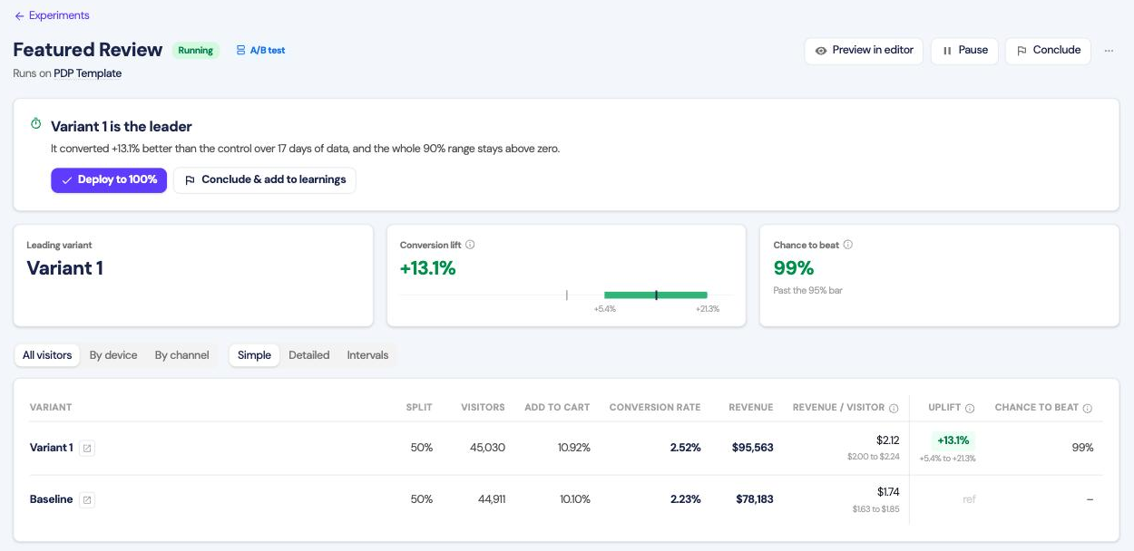
The verdict banner
When a test concludes, the banner gives you two actions:
- Deploy to 100% sends all traffic to the winning variant and stops the test.
- Conclude & add to learnings closes it and files what it found in Learnings.
Conclude losing tests too. A failed variant still tells you something, but only if it is recorded.
The summary cards
The first card is the lift on your primary conversion: how much better the leading variant converted, with the range the true effect sits in. A range entirely above zero is what makes a win real. A range crossing zero means the direction is still unknown.
Revenue lift is the same for revenue per visitor. Without revenue tracking, this card shows the add-to-cart lift instead.
Visitors tested counts the visitors the test has seen.
When the window completes, the result card names the leader, or reads No leader found or Not enough data. No leader is named before then. See Calling the result.
Read the range, not the number
"+13.1%" is a best guess. "+5.4% to +21.3%" is what the data supports. Forecast against the low end.
The table
| Column | Meaning |
|---|---|
| Split | Share of traffic. Even, and fixed for the life of the test |
| Visitors | Unique visitors who saw this variant |
| Add to cart | Share who added to cart, when that goal is on |
| Conversion rate | Share who completed your primary conversion |
| Revenue | Total revenue from this variant |
| Revenue / visitor | Revenue divided by visitors, with its range |
| Uplift | Conversion rate against the original, with its range |
| Chance to beat | Probability this variant beats the original. Your account's bar, 90% by default, calls a winner |
Revenue per visitor is the one to watch. It is conversion rate multiplied by average order value, so it catches a variant that converts more people onto cheaper products. It also decides between variants that both clear the bar. Conversion rate up and revenue per visitor flat means the change moved who buys, not how much they spend.
Revenue columns need the Dalton Pixel.
Breaking it down
By device and By channel re-run the comparison on a slice of traffic. A change can win on desktop and lose on mobile. Segments need 500 visitors per variant, so they appear later than the headline figures.
Simple, Detailed and Intervals control how much of the table shows. Detailed adds orders and average order value. Intervals shows the range for every figure.
Differences from GA4
Dalton and GA4 attribute sessions differently and exclude bots differently, and GA4 samples large reports. Act on the relative comparison. See Analytics Integration.